 |
The six colour system by Winsor Newton | 
|
|
The six colour system by Winsor Newton |
|
A broader spectrum can be mixed with six colours as discussed under Basic colour theory on page 4. As a learning exercise, the move from three colours to six also begins to introduce other variables like opacity, tinting strength, drying rate, and granulation, depending on the type of colour used. Here are the recommended six
colour palettes;
Artists� Oil Colour: Winsor Lemon, Winsor Yellow, French Ultramarine, Winsor Blue (green shade), Permanent Rose and Cadmium Red.
Artists� Water Colour: Winsor Lemon, Winsor Yellow, French Ultramarine, Winsor Blue (Green Shade), Permanent Rose and Scarlet Lake.
Finity Artists� Acrylic Colour: Lemon Yellow, Azo Yellow Medium, Ultramarine Blue, Phthalo Blue Green Shade, Permanent Rose and Cadmium Red Light.
Artisan Water Mixable Oil Colour: Lemon Yellow, Cadmium Yellow Hue, French Ultramarine, Phthalo Blue (Red Shade), Permanent Rose and Cadmium Red Hue.
Artists� Oilbar: Cadmium Lemon, Cadmium Yellow Pale, French Ultramarine, Manganese Blue Hue, Permanent Magenta and Cadmium Red.
Griffin Alkyd Fast Drying Oil Colour: Cadmium Lemon, London Yellow, French Ultramarine, Phthalo Blue, Permanent Rose and Cadmium Red Medium.
Designers� Gouache: Lemon Yellow, Permanent Yellow Deep, Phthalo Blue, Ultramarine, Scarlet Lake and Alizarin Crimson.
Winton Oil Colour: Cadmium Lemon Hue, Cadmium Yellow Hue,
French Ultramarine, Phthalo Blue, Permanent Rose and Cadmium Red Hue.
Cotman Water Colour: Lemon Yellow Hue, Cadmium Yellow Pale Hue, Ultramarine, Intense Blue, Permanent Rose and Cadmium Red Hue.
Galeria Flow Formula Acrylic Colour: Lemon Yellow, Cadmium Yellow Deep Hue, Ultramarine, Winsor Blue, Permanent Rose and Vermilion Hue.
Other palettes can be created by individual artists choosing a different selection of six colours. For example, both Winsor Blues rather than an Ultramarine and a Winsor Blue. The variations are endless!
Six colour systems give clean, bright secondary colours but of course this is not enough. The remainder of this section of the booklet looks at some of the many other reasons why artists will still use more than six colours.
Across the range of hue
 |
Looking at a Hand Painted Colour Chart, or for example,the range of printed blues from Artists� Oil Colour above, the relative nature in hue and undertone of each colour is obvious. In practice, the artist may already have Winsor Blue (Green Shade), yet might use another green shade blue, Prussian Blue, for its lower tinting strength.
The Winsor & Newton range must also offer all artists the opportunity to select the palette of their choice, whatever that may be. Some may prefer to use only a Cerulean Blue in their palette.
Additional colours within the same hue may also be used due to variations in opacity, tinting strength, drying rate, granulation etc. Manganese Blue Hue may be used for its transparency and Cerulean for its opacity, although they are both light blues.Equally, there are greens, violets and oranges which are unique within the spectrum and so artists will supplement their palette with those greens and violets, etc.
Different Names
The names of colours can vary from range to range, for example, Winsor Blue in Galeria Acrylics and Phthalo Blue in Winton Oil Colour are both made from
phthalocyanine blue. This is principally for historical reasons; colours were known by different names in different decades. The pigment content of each colour is
usually detailed on the tube or may be found in our booklet, Notes on the Composition and Permanence of Artists� Colours or in the Winsor & Newton catalogue.
| Single Pigments The common understanding that mixing too many colours together results in muddy browns is due to the subtractive nature of colour mixing with paints. The use of single pigments wherever possible by Winsor & Newton in manufacturing is therefore an important benefit. For example, in Artists� Water Colour, Scarlet Lake and Winsor Red are included in the range because Scarlet Lake is very yellow whilst Winsor Red is very blue. The result is two distinct colour positions, each being brighter than an equivalent hue made from more than one pigment. The use of both colours will produce a wider range of mixtures, each being clean and bright. |
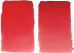 Scarlet Lake Winsor Red |
The same principle applies to single pigments in the green, orange and violet areas of the spectrum. These are usually known as secondary colours, however
Winsor & Newton ensure that there are also as many single pigment �secondaries� available to the artist as possible. A single pigment green will provide a more intense (ie. further away from black) colour than if the artist were to try to
mix that same green made from blue and yellow.